

I worked as a Product UI/UX Designer on the development of a new feature for a major energy distribution company’s app: the Fixed Plan. Inspired by ANEEL’s 2nd Tariff Sandbox Call, the project proposed an innovative billing model in which the consumer would pay a fixed monthly amount on their electricity bill, with periodic quarterly, semi-annual, or annual adjustments.
Unlike prepayment, the model aimed to offer customers predictability while reducing losses and delinquency for the utility company, improving cash flow and driving greater consumer engagement.
The target audience consisted of residential Group B consumers, excluding low-income customers and distributed generation participants. Eligibility also factored in criteria such as consumption reporting intervals, account settlement frequency, remote consumers, separate tariff flags, and early entry, making the project strategically and design-wise challenging.
Journey Mapping with the Business Team
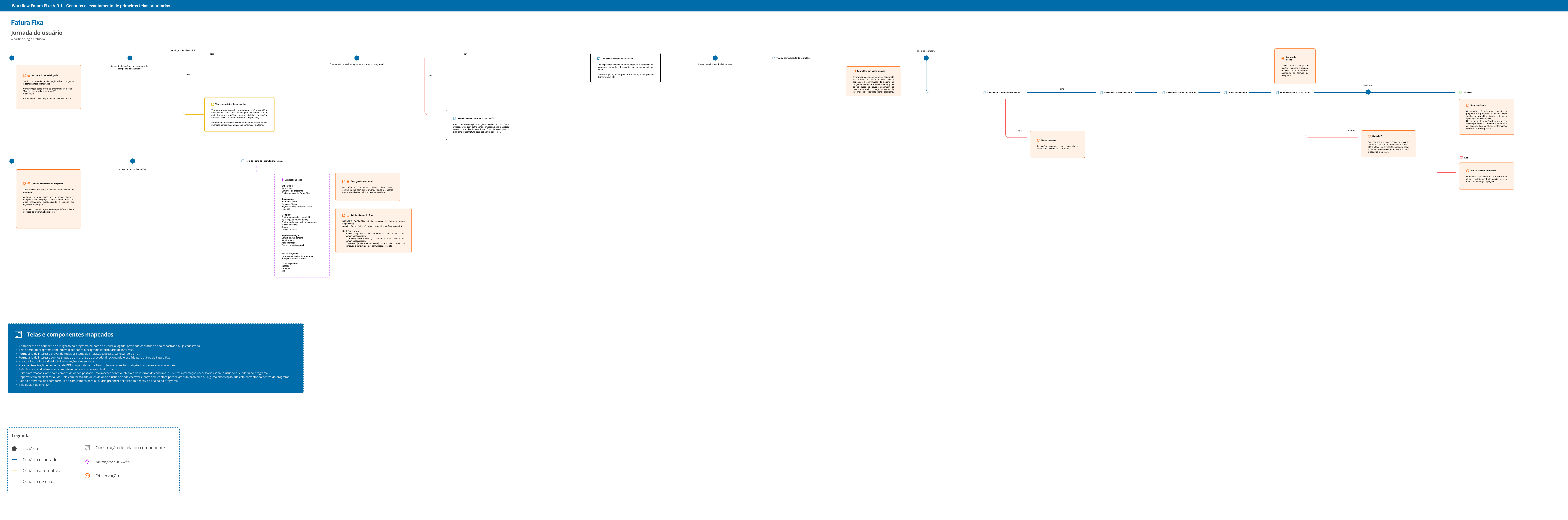
The first step was diving deep into the business rules alongside the responsible team. We ran alignment sessions to thoroughly understand the eligibility criteria, covered user groups, and regional particularities of the program. Only customers from specific regions of the country could participate, which required careful journey mapping across different scenarios and profiles.
During this phase, I actively contributed to translating technical and regulatory complexities into logical, understandable flows, ensuring the user experience was fully compliant with ANEEL’s guidelines and the company’s own directives.
Component & Style Building
With the journey mapped, I moved on to building the visual elements that would bring the new feature to life. The main challenge was integrating the Fixed Plan into the app without losing consistency with the company’s already established design system. I created new components and styles that seamlessly aligned with the existing visual identity, ensuring a cohesive and familiar experience for the user.
Check the file
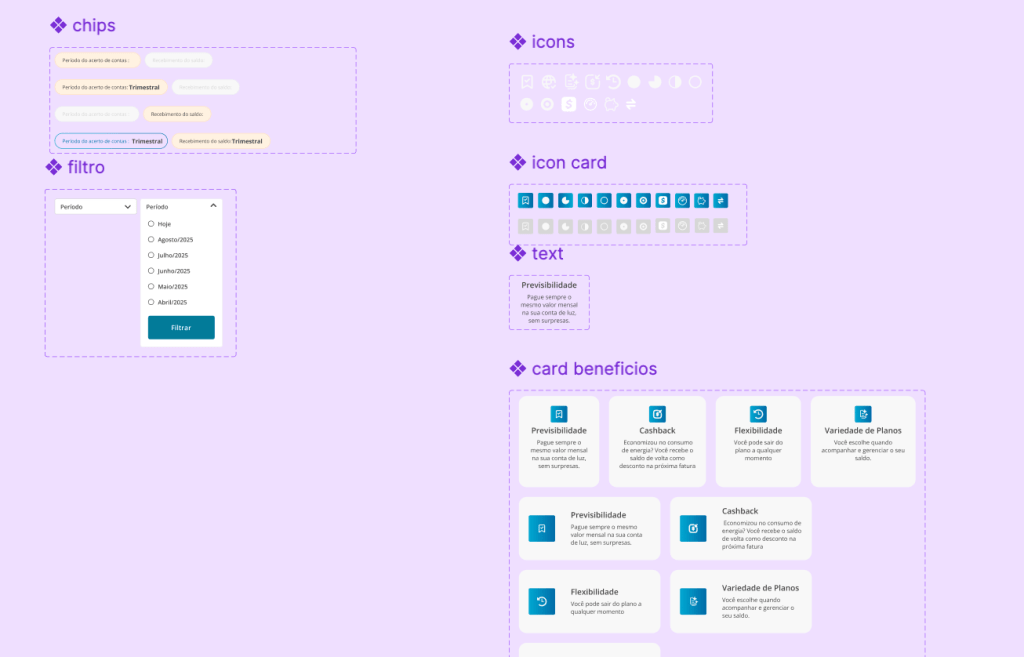
Informational cards, action buttons, status screens, visual indicators, and feedback elements were developed to clearly communicate each step of the process, always respecting accessibility and usability guidelines.
Pre-Registration: The First Touchpoint
The user’s interaction with the Fixed Plan began at pre-registration. Since the program was restricted to specific groups, the app automatically verified the customer’s eligibility based on location and consumption profile. If eligible, an invitation screen was displayed explaining the plan’s benefits.
Check out the workflow in the video below:
Navigate the prototype here
From there, the user was guided through a simple, intuitive step-by-step process:
Introduction to the Fixed Plan, with clear language about the billing model and periodic adjustments;
Eligibility confirmation, reinforcing that the program was available for their profile;
Choice of adjustment frequency (quarterly, semi-annual, or annual);
Review of terms and acceptance to participate:
Pre-registration confirmation, with information that the enrollment would proceed to review
Status: Under Review
After pre-registration, the user was informed that their request was under review. The app displayed a clear status indicator, along with an estimated response time and guidance on the next steps. Transparency was key to maintaining customer trust while internal criteria were validated.
User Enrolled in the Program
Once approved, the user officially joined the Fixed Plan. The program’s home screen was updated to reflect this new status, displaying:
Current fixed monthly amount;
Next adjustment date;
Billing history within the plan;
Active benefits and usage guidelines.
The customer also began receiving personalized notifications about the plan’s progress, periodic adjustment reminders, and relevant communications.
Option to Leave the Program
Recognizing that freedom of choice is essential to a great experience, the project included the option for users to leave the program at any time. The cancellation flow was designed to be simple and straightforward, with a few confirmation steps to ensure the customer was fully aware of the implications — such as returning to the conventional tariff.
Outside the Program: Access to History
Even after leaving, the user retained access to the Fixed Plan section, which became a full record of their participation. They could consult periods of enrollment, amounts paid, adjustments made, and benefits used. This feature valued the customer’s journey and kept the door open for a possible return.
Impact & Results
My work on the Fixed Plan project spanned every stage of the design process, from a deep understanding of business rules to delivering a functional, accessible experience aligned with the brand identity. The result was a feature that not only met regulatory and business objectives, but also placed the customer at the center of the experience, offering predictability, clarity, and control over their energy bill.
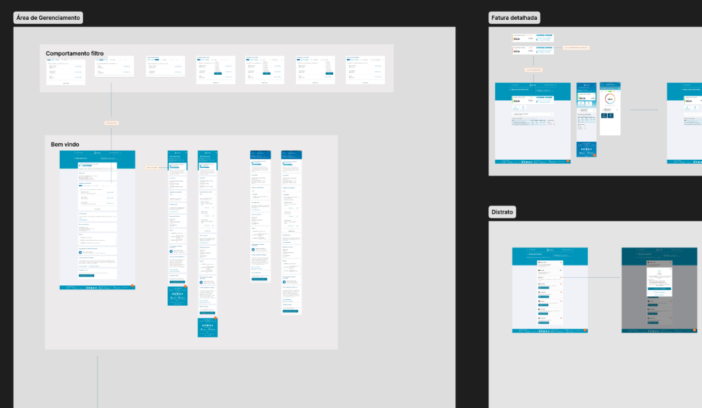
Access the full version of Figma
Check the file for the other mapped scenarios and additional journey interactions.
 Ygor Dutra Portfólio