
Conversation App for Language Learning
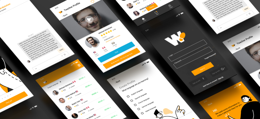
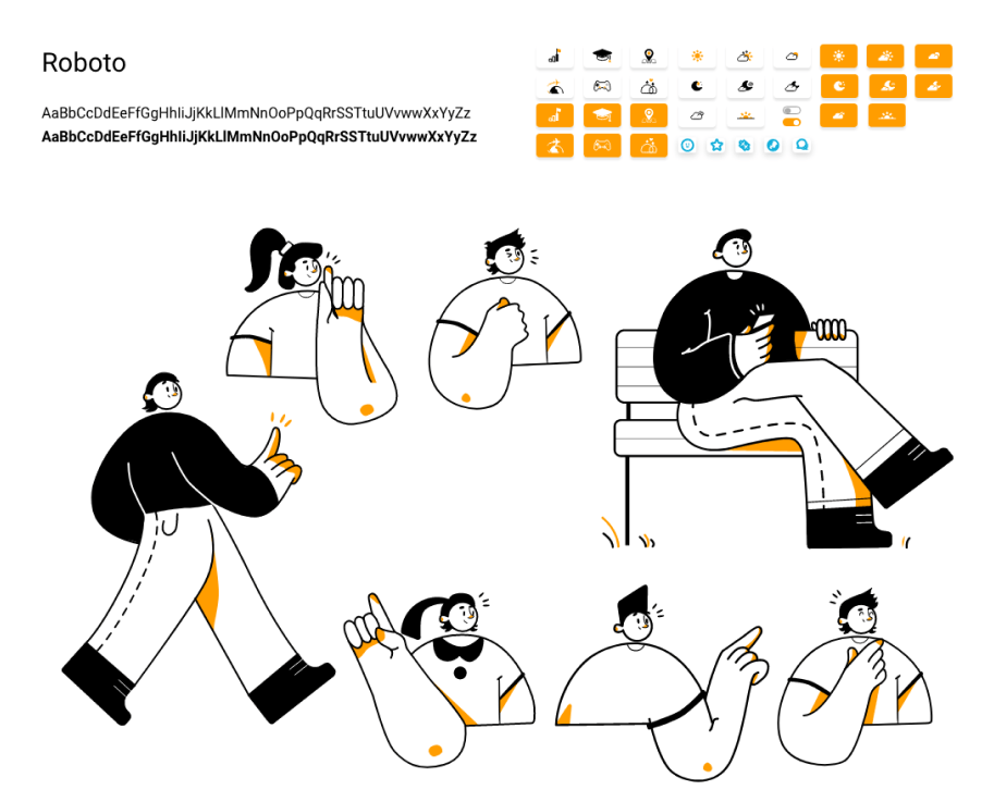
One of the first challenges was developing an intuitive, welcoming iconography capable of communicating complex features in a simple, universal way. Custom icons were created for navigation, status and specific features, ensuring visual consistency across every screen of the app.
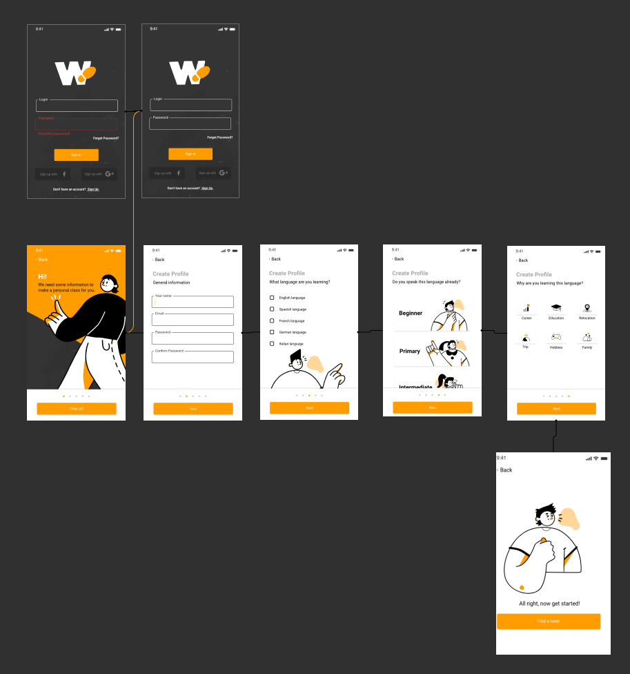
Onboarding
The user’s journey began with a carefully structured onboarding designed to collect essential information and personalize the entire future experience. Through dynamic, welcoming screens, learners were asked which language they wanted to learn, their current level of understanding, and their preferred times for taking a class. This information not only guided teacher recommendations but also fed into the app’s integrated schedule, which would already suggest time slots matching the student’s availability.
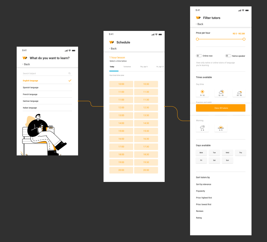
Integrated Schedule
The schedule was one of the app’s core features, letting students view all their booked classes, receive automatic reminders, easily reschedule or cancel appointments, and access a complete history of past classes. The interface was designed to be clean and intuitive, making managing one’s studies simple and even enjoyable.
Chat and Teachers
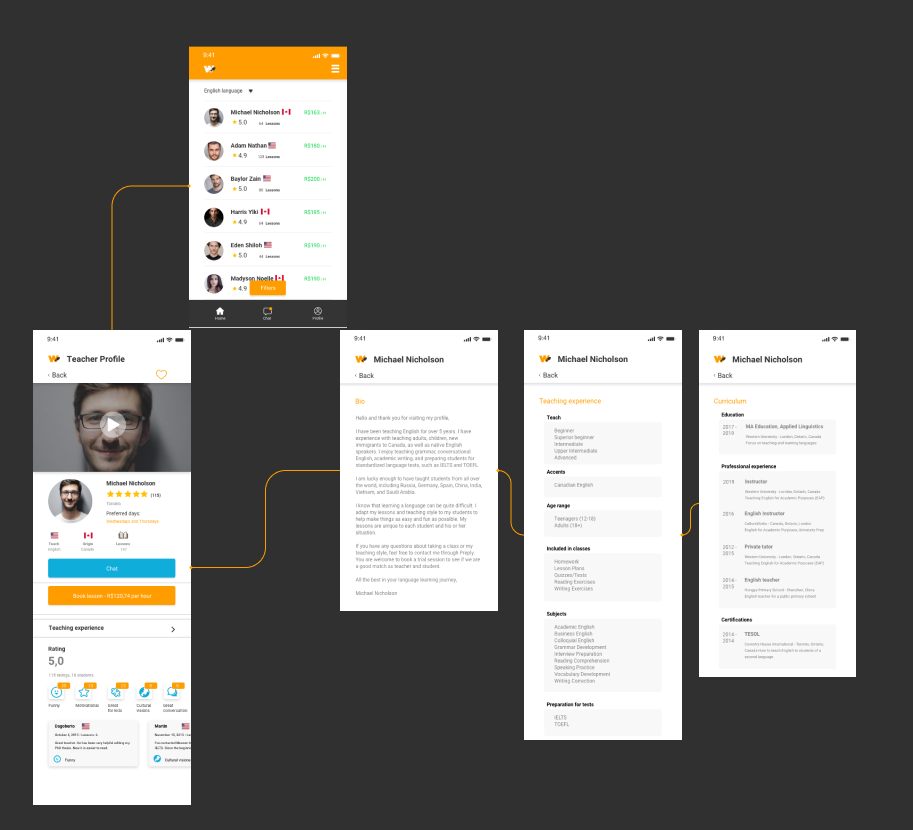
One of the most important moments in the journey was choosing a teacher. For this, a dedicated section was developed for teacher profiles, with detailed information such as name, nationality, languages taught, proficiency levels, personal bio, teaching approach, reviews from other students, and availability on the integrated schedule. Students could contact teachers directly to ask questions before booking their first class, building a relationship of trust from the very start.
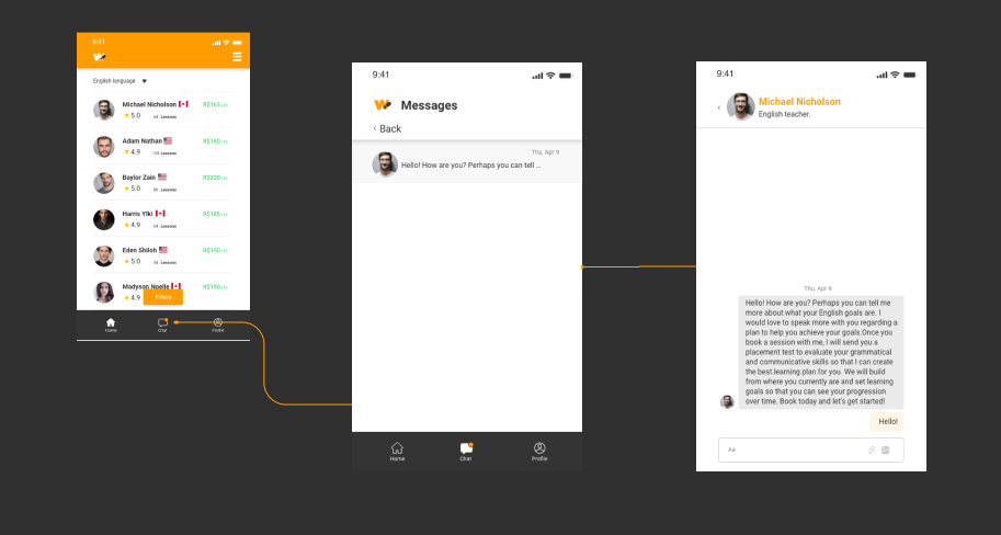
To make messaging between students and teachers easier, an internal chat was implemented in the app, allowing real-time messages, material sharing, and push notifications for new messages, with a complete history stored in the app.
Illustrations
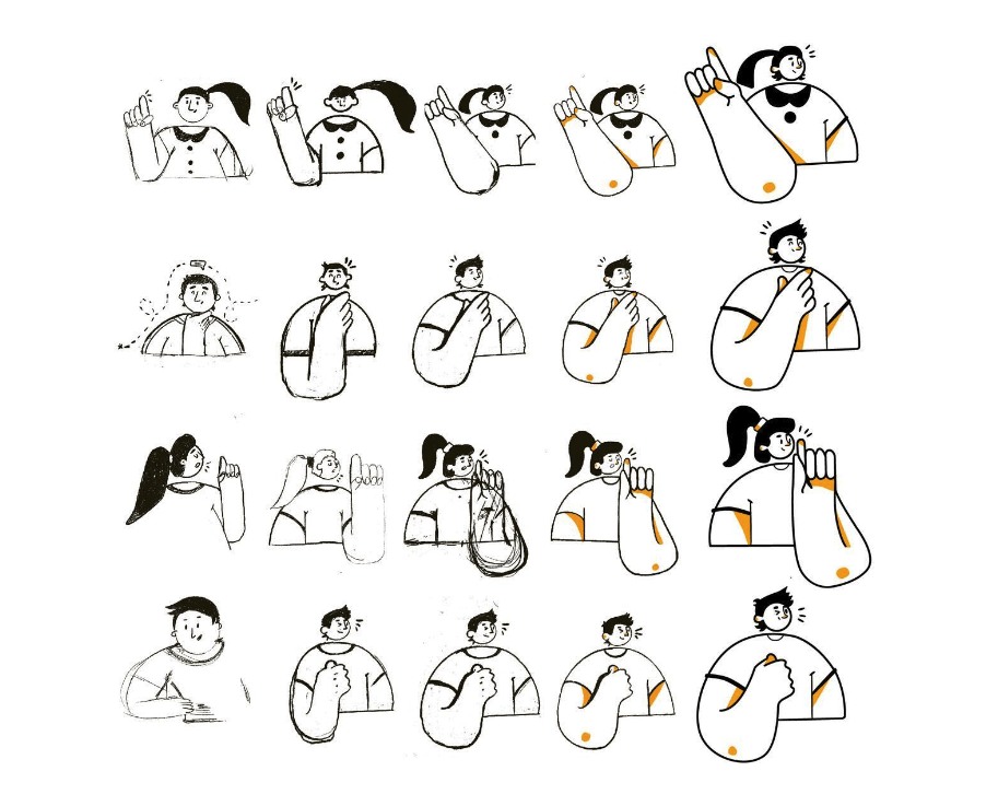
Illustrations played a key role in building the visual identity, giving the experience personality and warmth. The creative process began with hand-drawn sketches exploring concepts and compositions, followed by digital refinement where the shapes gained definition.
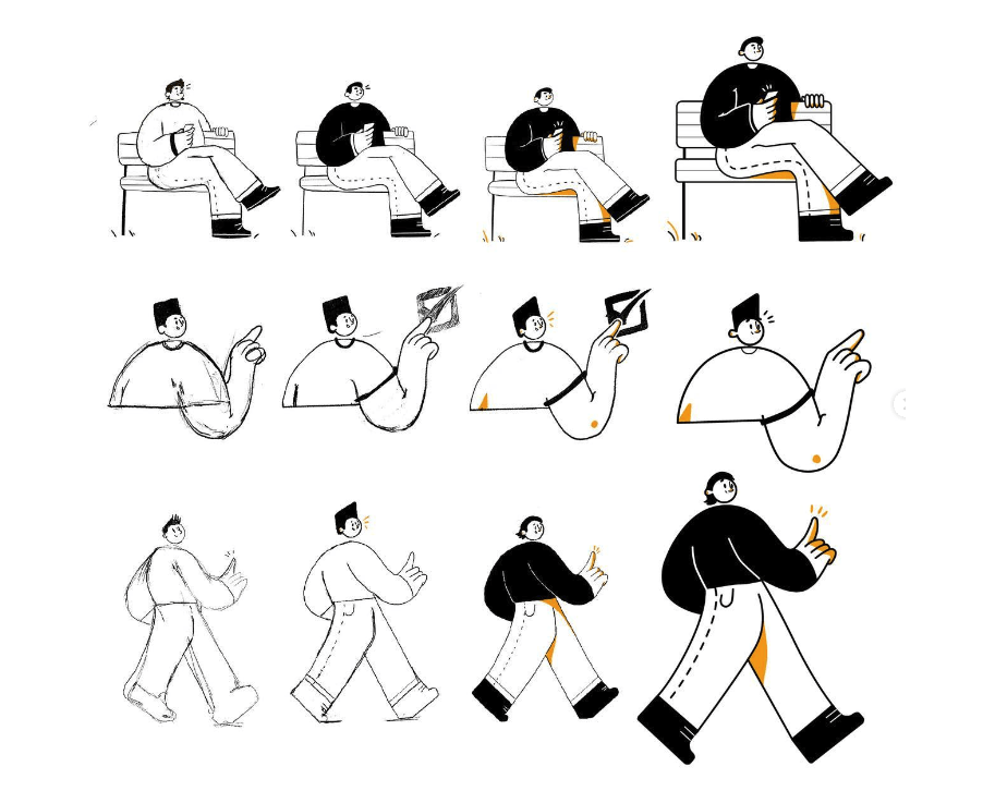
After defining the color palettes and line style, fluid, welcoming and slightly playful, the illustrations were vectorized, gaining precision and scalability. Applied at strategic moments in the journey, such as onboarding screens, empty states, positive feedback, and decorative elements, the illustrations made navigation lighter and more human.
The result was an app that delivered a complete, personalized experience, where every detail, from iconography to illustrations, from onboarding to scheduling, was designed to put the student at the center of the process. The ability to choose teachers based on detailed profiles, communicate through an internal chat, and easily manage a schedule turned language learning into a fluid, welcoming, and genuinely connected journey. The design didn’t just make the app easier to use, it built a relationship of trust and belonging between students, teachers and the platform, proving that when design meets purpose, it can transform the way people learn and connect.

