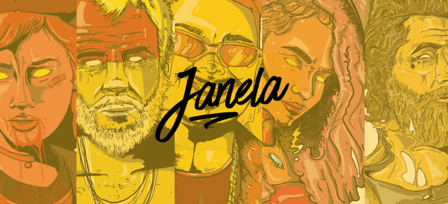
Creating illustrations for individual drinks goes far beyond drawing glasses and ingredients. The real challenge is translating sensations, the intensity of a vodka, the freshness of a tea, the heat of cinnamon, or the mystery of absinthe, into visual elements that speak directly to whoever is enjoying the drink. Each cocktail has its own personality, story and unique balance of flavors, and the mission was to capture that essence in original illustrations for five distinct cocktails: Russa Loka, Chá da Rainha, Seu Zé, Bola de Fogo and Irlandês Voador.
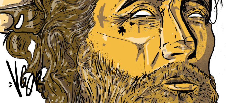
Irlandês Voador (Flying Irishman)
The Mystery of Absinthe Absinthe, with its mystical aura and high alcohol content, inspired an enigmatic, sophisticated illustration. The palette of deep greens and dark tones evokes the drink’s characteristic color and the mystery surrounding it. Elements like stylized wings, a direct reference to “Flying” in the name, arabesques, and details reminiscent of smoke or mist create a dreamlike atmosphere. The illustration conveys the feeling of a drink that isn’t just consumed, but experienced.
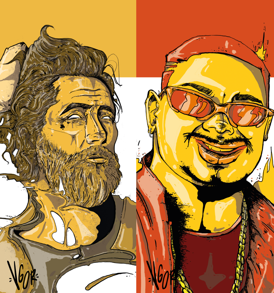
Bola de Fogo (Fireball) — The Heat of Cinnamon
Here, the challenge was translating the heat of cinnamon and the energy of the name. The illustration explores a warm, vibrant palette, with intense oranges, reds and yellows evoking fire. Stylized flames, spirals suggesting movement and heat, and textures reminiscent of cinnamon sticks create a dynamic, intense composition. The typography has curves reminiscent of flames, and small elements like stars or sparks complete the feeling of a drink that warms you from within.
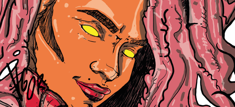
Chá da Rainha (Queen’s Tea) — The Charm of Softness
For Chá da Rainha, a softer, more refined drink, the approach was completely different. Delicate, organic lines, soft colors like muted gold, mint green and hints of lavender create an atmosphere of elegance and warmth. Floral elements and stylized tea leaves evoke the drink that inspired the name, while light, airy shapes convey the softness of the flavor. The illustration invites the viewer to experience something delicate and special.
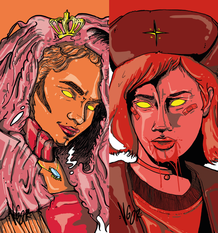
Russa Loka (Crazy Russian) — The Strength of Vodka
Representing the intensity and strong personality of vodka, Russa Loka called for an illustration to match. Bold, expressive lines were used, along with a cool color palette, tones of blue, silver and white, evoking ice and the purity of vodka. Elements like stylized ice crystals and dynamic lines suggest the drink’s power, while red details hint at the “craziness” the name suggests. The robust typography complements the sense of strength and authenticity.
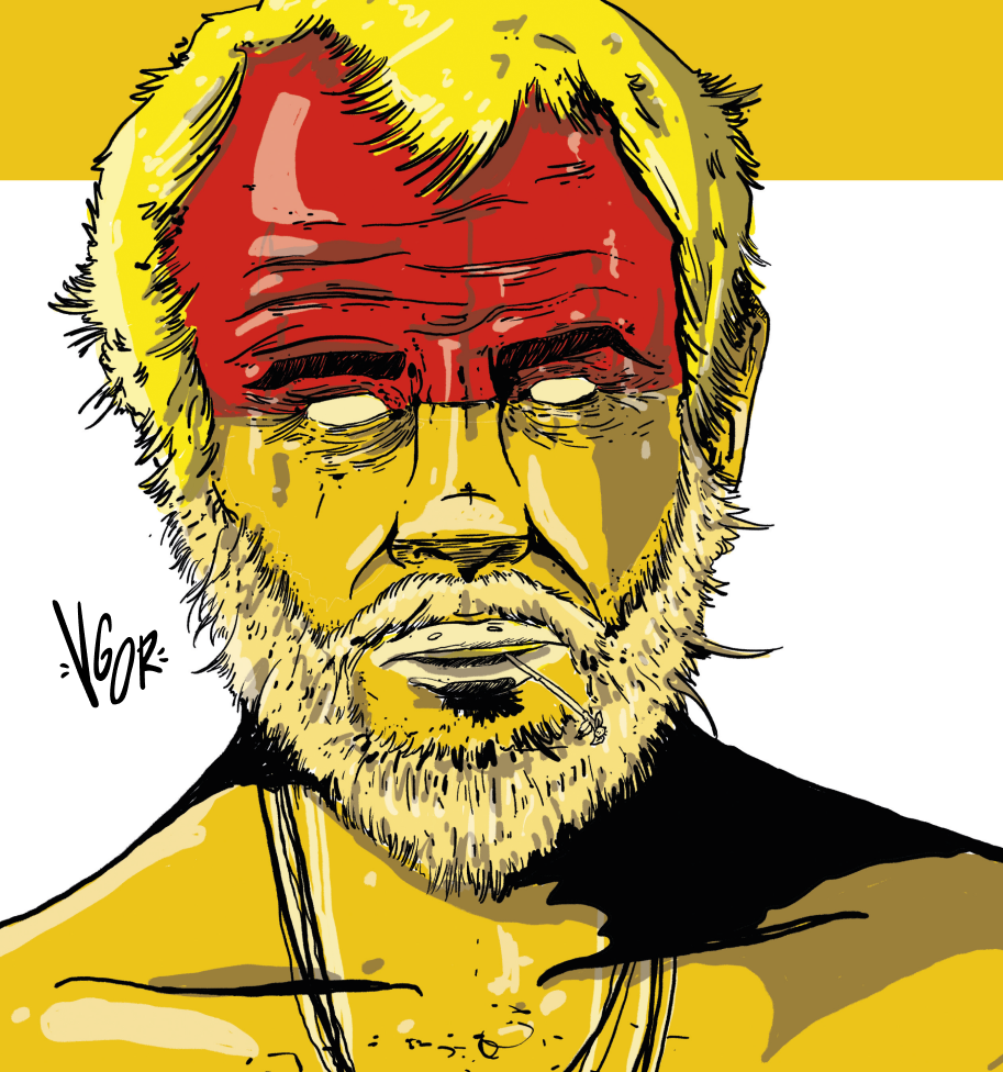
Seu Zé — Jambu Cachaça and the Amazon
Jambu cachaça, with its Amazonian heritage and the characteristic light tingling it leaves in the mouth, inspired an illustration rich in natural elements. The earthy palette, with deep greens and clay tones, evokes the forest. Stylized jambu leaves, textures reminiscent of Amazonian vegetation, and organic, hand-drawn lines translate the drink’s artisanal, rooted essence. The name “Seu Zé” is given a warm typography, like an invitation to experience Brazil in a glass.
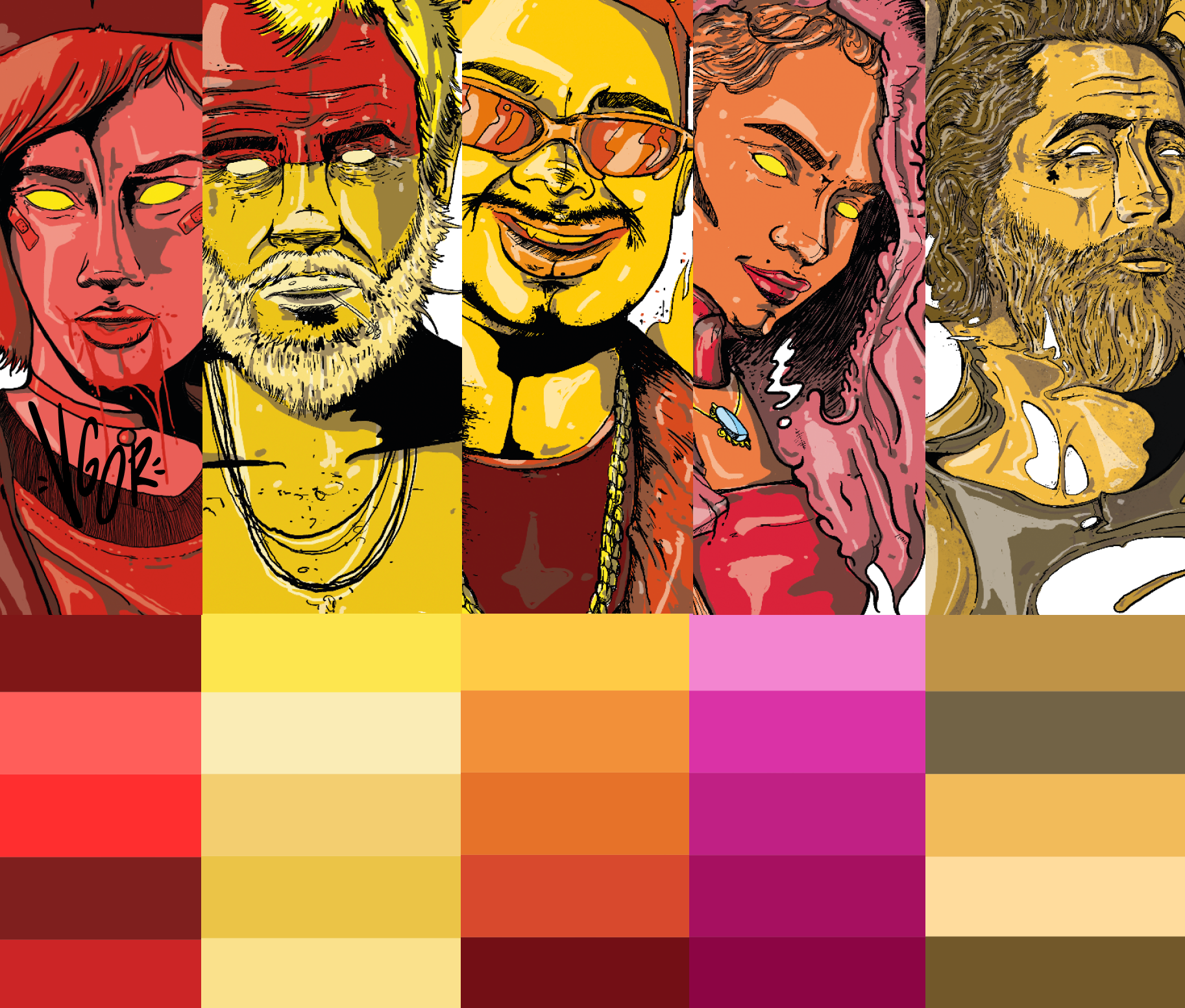
The careful choice of color palettes was decisive in making each illustration not just represent a drink, but visually communicate the sensory experience it offers. Colors acted as a bridge between sight and taste, preparing the viewer for what was to come: tones that translate intensity, softness, freshness or mystery build anticipation and spark desire even before the first sip. A good color choice turns an illustration into an irresistible invitation to try.

